Apple didn’t just launch another accessory, they reintroduced a cultural idea through the new iPhone Pocket. The ISSEY MIYAKE collaboration turns a simple knitted pouch into a fashion-tech signal, reviving what many would call the modern iPhone sock moment. And if you’ve been following our earlier prediction about neon yellow entering the Apple ecosystem, this launch feels like a full-circle twist.
Table of Contents
Last month we wrote a post on MPiFY speculating that Apple might follow its orange-iPhone lead by launching an iPhone in a vibrant neon yellow colour. (See our original piece: “Apple’s 2025 Launch & What It Means for Creative Agencies"
Well…it happened. But not exactly as we imagined.
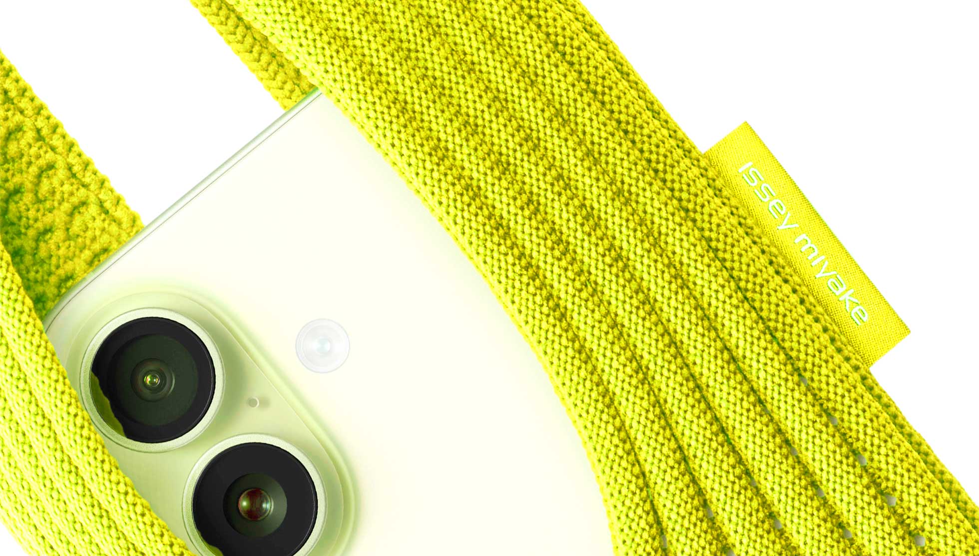
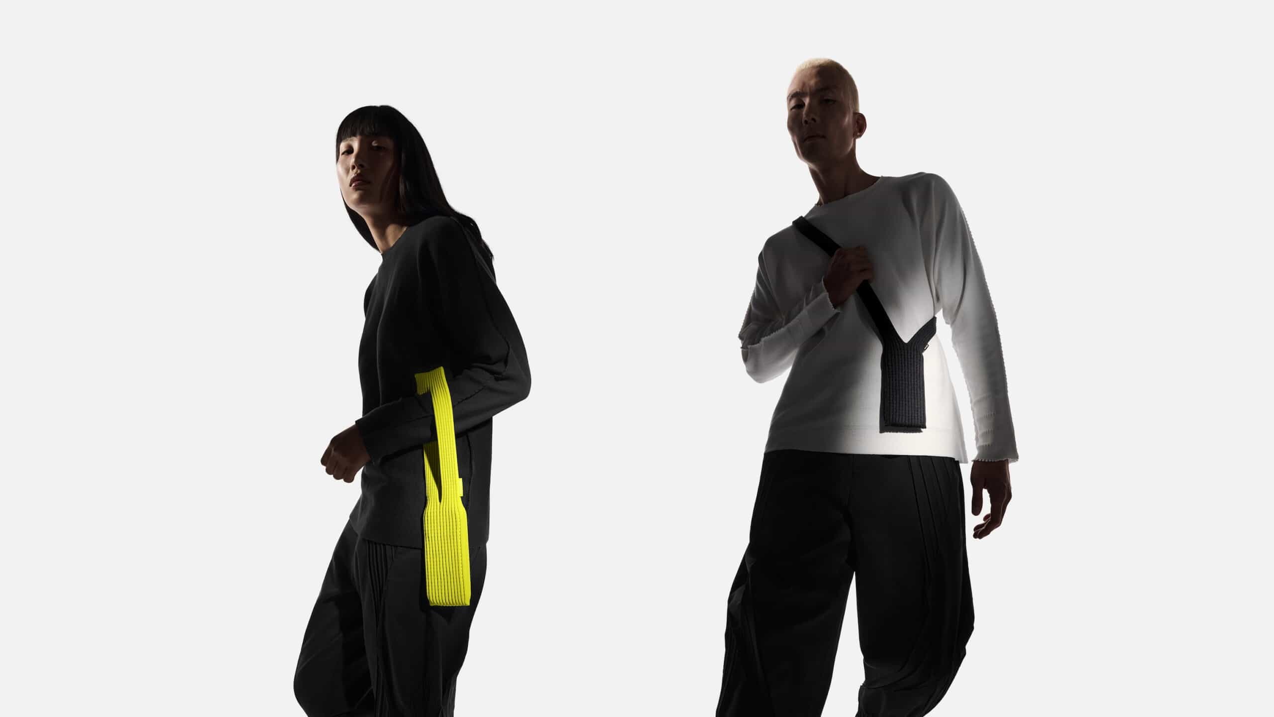
Apple didn’t just launch “an iPhone in neon yellow”, instead, they released the accessory that might well become the neon-yellow fashion statement of the season: the ISSEY MIYAKE × Apple iPhone Pocket. Released 14 Nov 2025, this 3-D knitted wearable “pocket” for your iPhone comes in a lemon (neon-yellow) option among others.
So yes, our prediction has come full-circle: neon yellow has arrived in the Apple ecosystem, but with a twist.
Let’s dive deep into what the iPhone Pocket really is, why the colour matters, how the collaboration came about, and (yes) what this means for creative agencies like MPiFY.
At first glance: it’s not a new iPhone model. This isn’t the “iPhone 17 Yellow Edition”. Instead, it’s a wearable accessory. From Apple’s own announcement:
“Born out of a collaboration between ISSEY MIYAKE and Apple, iPhone Pocket features a singular 3D-knitted construction designed to fit any iPhone as well as all pocketable items.”
“Inspired by the concept of ‘a piece of cloth’ … the development and design of iPhone Pocket unfolded in close collaboration with the Apple Design Studio.”
So what does it do?
In short: it’s a fashion accessory crossing over into tech, a bold statement that your iPhone is not just a device but part of how you carry your identity.

From our vantage at MPiFY, this is interesting for a few reasons.
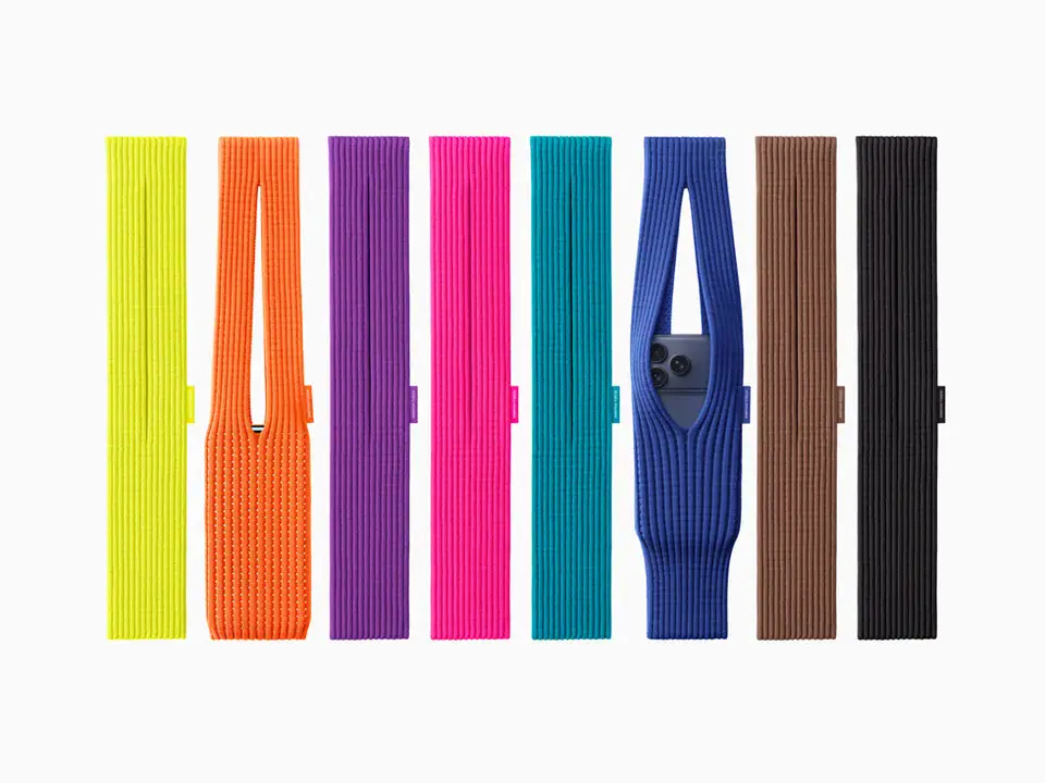
When you see neon yellow (or “lemon” in Apple’s palette) it shouts attention-grabbing, bold move, fashion first. Apple’s choice to include lemon/mandarin in the short strap line-up reflects not only tech accessory evolution but also fashion accessory thinking. Apple themselves say the palette was “intentionally designed to mix and match with all our iPhone models and colours.”
Our earlier post prompting “an iPhone in MPiFY neon yellow” hit a nerve precisely because we sensed Apple was trending toward accent colours beyond the usual. Now here it is, albeit in accessory form.
Phones have moved from pockets to being worn, carried, styled. The iPhone Pocket acknowledges that shift. As one design authority put it:
“The way that people carry and style their products has changed and is becoming even more of an expression of yourself.”
For your marketing and creative agency work: that means the handheld device is now part brand, part fashion, part accessory, and your visual storytelling should treat it as such.
The design brief: “a piece of cloth”. The execution: high-fashion knit, bold colour options, wearable accessory. On the surface simple, underneath faithful to both Apple’s industrial design DNA and ISSEY MIYAKE’s fashion heritage. Their collaboration has crafted something that sits at the intersection of both.

Let’s look behind the scenes of this partnership, good for inspiration, good for creative agency narrative.
ISSEY MIYAKE is a major Japanese fashion house, founded in 1971. Its design ethos centres on “bringing unprecedented originality for ease in everyday life.” Apple, of course, needs no introduction.
Interestingly, there is a historic link: the late Steve Jobs famously wore ISSEY MIYAKE black turtlenecks, the designer’s pieces becoming a visual part of the Apple brand identity. So this collaboration isn’t out of the blue, it’s almost poetic.
From the Vogue article:
“It was like a jazz session. Everyone brainstormed and asked, ‘how can we develop it further?’ ‘should we take it in this direction or that?’”, Yoshiyuki Miyamae, Design Director, Miyake Design Studio.
“We were interested in how they [at ISSEY MIYAKE] work, to see what we could learn from them, and the other way around.”, Molly Anderson, Apple’s VP of Industrial Design.
This exchange of methodology, design philosophies and cultural values is rich territory for any creative agency narrative, aligning innovation, minimalism, craft.
For Apple this is more than an accessory. It signals:
For ISSEY MIYAKE: collaborating with Apple opens up tech-fashion hybridity and intersects with mass-market visibility while retaining premium design credentials.
Here at MPiFY (that’s us!) we specialise in creative strategy, design, digital storytelling and brand growth. So here’s why this news is an important reference point for our work and our clients.
Your client’s product might be digital or physical, but the way their brand gets carried, held, worn, used, that’s experience design. Apple and ISSEY MIYAKE are pushing the boundary of how a tech object becomes a style object. For MPiFY clients, we can use this as inspiration: think about how brand-touchpoints go beyond “screen” and into “worn” or “tied-on”.

Neon yellow isn’t just a trendy shade, it signals boldness, personality, distinction. For branding work we can use this narrative: does the brand stand out? Is it willing to be bold? MPiFY’s earlier suggestion (to Apple!) of neon yellow shows that we’re already tuned into these signals. We can leverage this for our clients: colour identity, palette strategy, brand impact.
Clients often need a strong narrative: “We combine craft with innovation.” Apple and ISSEY MIYAKE’s story is a rich case: minimalism + knit fabric + device tech. For MPiFY we can mirror that when we position a brand: “We marry premium craft with agile digital innovation.” Using this case study can help us tell that story credibly.

The partnership between a giant tech brand and a high-fashion house is a model of cross-discipline collaboration. For MPiFY (a creative agency working with tech, events, digital, branding) this underscores the value of crossing silos: design + digital + physical event + lifestyle. It’s a reminder to pitch clients accordingly: don’t just build an app, build a lifestyle experience.
As we help clients build brands that are more than “just a website”, this story is gold. It’s not about an iPhone, it’s about how you carry, wear, show your iPhone. That’s a shift in value proposition. MPiFY can help clients across tech, e-commerce, lifestyle think in these terms and position themselves accordingly.
Let’s circle back to MPiFY’s earlier nudge. In our article we suggested that Apple should introduce an iPhone in neon yellow, and we speculated on how colour and accessory trends might evolve. So when the iPhone Pocket launched and included lemon (neon-yellow) in its line-up, we were ready.
What this illustrates: launching predictions, being tuned into cultural design rhythms, and using those as creative triggers for our clients. At MPiFY, we believe being ahead of the curve isn’t about guessing specs, it’s about reading the culture, design cues and user behaviour.
Now with Apple’s move, it’s not just about the product, it’s about the lifestyle. And that’s where brand messaging, content strategy, event experience and digital ecosystem converge.
We’re seeing the convergence of product, accessory, style, identity. The Apple × ISSEY MIYAKE partnership isn’t just about an iPhone pouch, it’s a shift in how devices are integrated into personal style. It signals that user behaviour (carrying a phone) is no longer a neutral act, it’s a fashion moment. Agencies and brands that understand that will lead.
At MPiFY, we’re in the business of telling stories that bridge design, technology and brand. If your brand is looking to create striking colour-identities, build out accessory ecosystems, design experiential campaigns, or align your digital product with lifestyle signals, we’ve got you.
We helped a number of clients in Malta, the Mediterranean and globally craft brand ecosystems that go beyond logos and websites, into wearable identities, event experiences and bold colour moments. Let’s talk about how your next launch can become the “neon yellow moment” of your industry.
If you’ve been an Apple fan long enough, the moment you saw the iPhone Pocket you probably felt a strange déjà vu, like a warm 2004 breeze hit you right in the nostalgia.
Because yes…
Apple has done the knitted-sock-for-devices thing before.
And it was glorious.
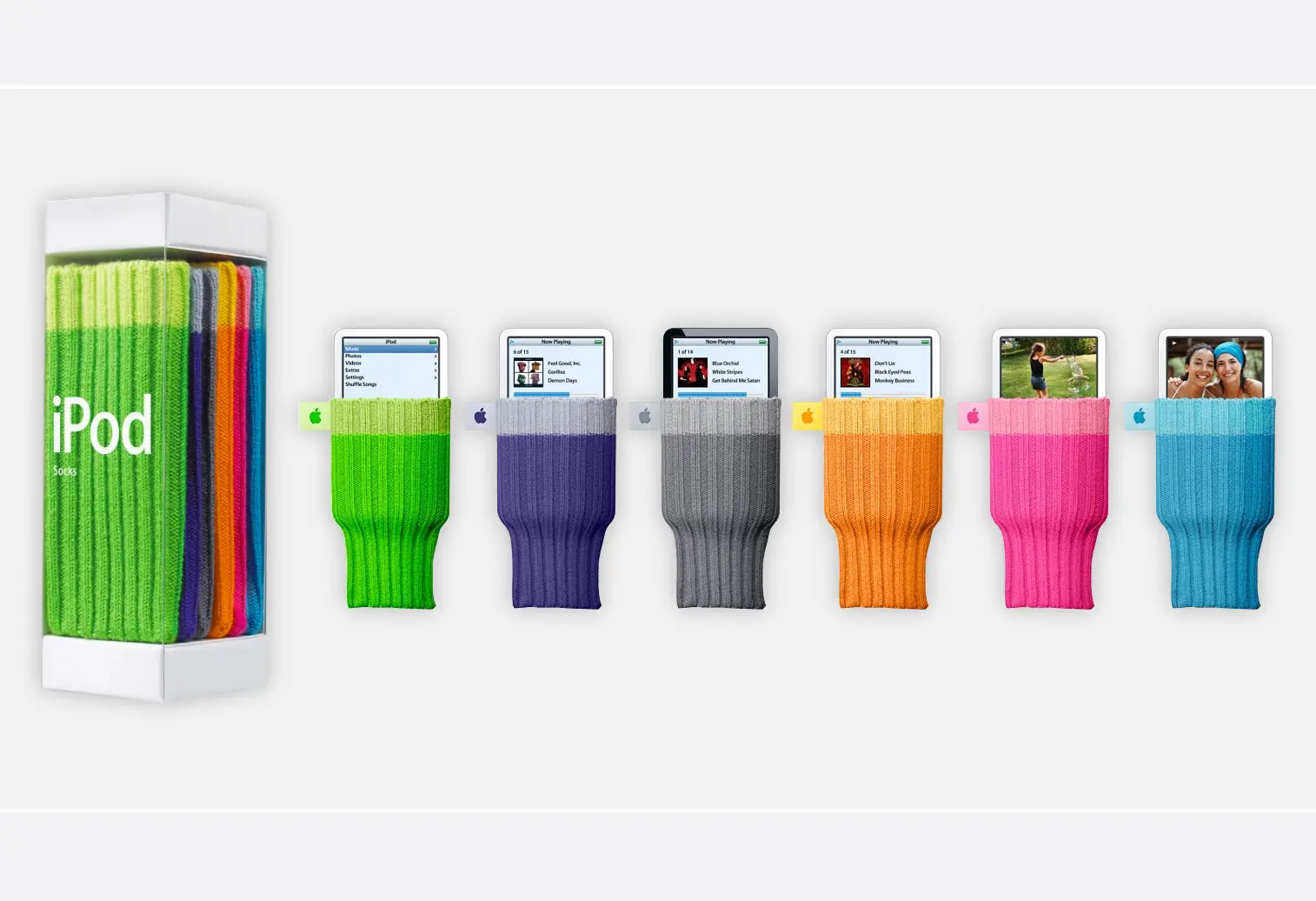
Back in the iPod golden age, Apple released one of its most unexpectedly loved accessories: the iPod Socks. A pack of six colourful, ribbed, knitted sleeves that protected your iPod while also making it look like it was wearing…well, clothing.
The similarities to the new iPhone Pocket are almost poetic:
And let’s be honest, the iPod Sock was peak Apple: minimal, weirdly charming, borderline unnecessary, yet somehow irresistible.
Fast forward 20+ years, the knitted sock concept grew up and got a fashion-tech degree.
The iPhone Pocket takes the iPod Sock’s playful DNA and elevates it into a high-fashion collaboration with ISSEY MIYAKE, turning what used to be a novelty accessory into a wearable design statement.
If the iPod Sock was the quirky cousin, the iPhone Pocket is the polished, runway-ready sibling:
Yes, we wrote it: we saw the neon yellow coming. But beyond that it’s not the colour that’s exciting, it’s the signal. A major tech brand isn’t just releasing a phone colour, it’s releasing a wearable concept. A high‐fashion design house isn’t just “doing clothes”, it’s collaborating on a tech accessory. That’s where the creative magic happens.
So whether you’re a brand about to launch a product, a marketer plotting a campaign, or an agency pushing the frontier, look at how objects are carried, how colours speak, and how collaborations shape meaning.
No. It is a wearable knitted accessory created by Apple Inc. in collaboration with ISSEY MIYAKE.
Conceptually, yes. It functions similarly to a knit pouch or sock, but elevated with 3D construction and fashion positioning.
Short strap versions include lemon (neon yellow), mandarin, purple, pink, peacock, sapphire, cinnamon and black. Long strap versions include sapphire, cinnamon and black.
It offers textile cushioning but does not replace a rigid protective case.
It signals Apple’s embrace of bold colour expression and fashion alignment within its accessory ecosystem.
While not officially branded as such, the aesthetic and knit concept strongly echo the earlier iPod Socks era.


.svg)
