Apple Liquid Glass represents far more than a cosmetic update to Apple’s interface design. With the introduction of this new visual language across its ecosystem, Apple has redefined how software feels, not just how it looks. By blending translucency, depth and responsive motion, Apple Liquid Glass introduces a softer, more tactile experience that signals a broader shift in digital interaction.
Table of Contents
With macOS Sequoia, iOS 18, iPadOS, and even watchOS, Apple has introduced a softer, more organic UI direction. Apple’s new Liquid Glass design language is more than a visual upgrade, it’s a sensory shift. Unlike the flat minimalism of the past decade, this design reintroduces dimension, light diffusion, and depth, but without the heaviness of old skeuomorphism. The translucent layers and blurred panels create the feeling of a living interface that moves and breathes with you. It’s clean but not cold, fluid yet familiar. This isn’t just about looks, it’s about how it feels to use your device.
In this article, we’ll break down:
Flat design helped declutter our screens. It was logical for its time. But now, with more powerful hardware and higher resolution displays, the question becomes: What else can our interfaces express? Liquid Glass signals Apple’s answer. By reintroducing layering, light, and materiality, Apple is letting the software feel like part of your environment, not just something sitting on top of it. There’s personality in the way menus slide, in the glow of buttons, and in the way windows bend light. Design is no longer flat. it’s experiential.
So yes, Apple is moving toward something more dimensional, expressive, and emotionally resonant.
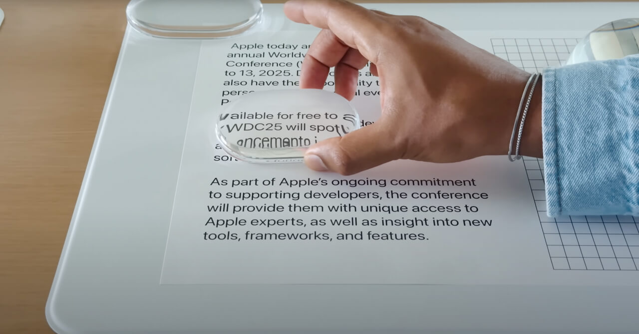
Liquid Glass is Apple’s latest evolution in UI design, a new visual language that blends realism with restraint. It’s a software-rendered interface style that behaves like real glass, subtly refracting and bending light, casting soft shadows, and gently reacting to your touch or movement. Unlike skeuomorphism, which mimicked real-world textures and objects directly, or flat design, which stripped away visual depth, Liquid Glass strikes a poetic balance. It’s minimal, yet immersive.
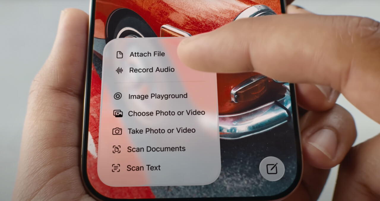
You’ll notice it in how buttons float just above the content, how widgets shimmer or distort background elements as you scroll, or how interface layers gently flex and respond, giving everything a sense of air and space. It’s designed not to show off, but to evoke. Less about what you see, more about what you feel. A design language that invites interaction by making digital environments feel tactile, fluid, and emotionally aware.
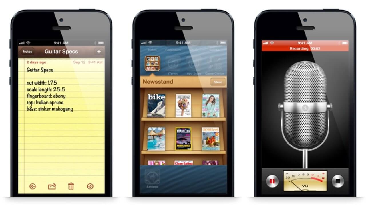
Remember when buttons looked like buttons and Notes looked like legal pads? That was skeuomorphism, a design trend where digital interfaces mimic real-world materials and textures. Apple led that era. Then it ditched it. Now? Liquid Glass brings it back, but evolved. It uses depth and texture not to imitate leather and felt, but to evoke clarity, tactility, and emotion. Icons float subtly above the wallpaper, shadows shift naturally with interaction, and translucency adds an ambient, immersive quality. It’s not nostalgic, it’s responsive.
That’s skeuomorphism. It was cute in 2010. Kinda weird now!
Got it? Good. Let’s keep going...
Liquid Glass isn’t about looking back, it’s not a revival of skeuomorphism or a rebellion against flat design. It represents a new design mindset, one that acknowledges the emotional weight of interface design. It lives in a delicate balance between utility and delight. The UI feels clean without being clinical, dimensional without being decorative, and intentional without demanding attention. It brings atmosphere to your screen, something that quietly supports your focus rather than competes for it.
But the real shift isn’t just visual, it’s systemic. For the first time in Apple’s history, we’re seeing a unified design language applied across every device platform, iOS, iPadOS, macOS, watchOS, and tvOS. It’s no longer about tailoring each system to its own look and feel. Instead, it’s about consistency, harmony, and making the Apple ecosystem feel truly seamless. Whether you’re switching from your iPhone to your Mac or your Apple Watch to your Apple TV, the experience now carries a shared, coherent aesthetic. That’s a significant philosophical leap.
At its heart, Liquid Glass feels like Apple’s response to a growing desire for softness in our digital lives. We live surrounded by screens, and that constant engagement demands more than efficiency, it calls for empathy. This new visual direction embraces tactility and nuance. It introduces interface layers that feel light yet present, animated with shadows and highlights that respond subtly to motion, gestures, and touch. Nothing feels bolted down, everything feels alive, fluid, intentional.
It’s also a quiet shift in how we engage with technology. Liquid Glass teaches us to feel our way through the UI, rather than stare at it. The design supports your journey without stealing your focus. It’s an ambient layer, one that becomes second nature the more you interact with it. And perhaps most tellingly, it sets the stage for Apple’s future platforms, like Vision Pro, where our screens are no longer confined to glass rectangles, but expand into spatial, ambient interfaces. Liquid Glass is not just a trend. It’s training our senses for what’s next.
Liquid Glass doesn’t just look better. It feels better. You sense intention in every shadow and curve. Buttons aren’t flat rectangles, they shimmer softly. Apps don’t just open, they unfold. This is design with emotional weight. Apple is making tech feel warm again. While some might call this a throwback to skeuomorphism, it’s more accurate to call it a step toward human-centric computing. Interfaces that feel less sterile and more alive. Design that’s not just functional but expressive.

Here’s our thought.
With Liquid Glass, Apple is easing us into a world where interface elements float over blurred, semi-transparent environments, much like how things work on the Apple Vision Pro.
Here’s a deeper theory: This shift is also about preparing users for Apple Vision Pro. On that device, digital interfaces live in a world filled with real-life distractions and depth. You’re not isolated, you’re layered into your surroundings. Similarly, the new Liquid Glass UI builds in that depth right on your phone or Mac. Transparent cards over blurred wallpapers, dock icons that hover, it’s the visual vocabulary of mixed reality. Apple is training us to navigate digital layers over physical space. It’s subtle, but powerful.
For designers, this is a signal to evolve. Forget the rules of flatness for flatness’ sake. Liquid Glass encourages play with layers, movement, blur, and softness. It asks us to think not just about UI, but UX, how it feels to tap, swipe, and engage. Typography now floats in space, icons glow, and context matters more than minimalism. Whether you design for mobile or desktop, the new Apple design language demands richer storytelling and more natural interfaces.
This shift reminds us that design systems should do more than decorate. They should:
A strong visual identity today is not just about logos and fonts, it’s about how your product feels in use. That’s what turns brand into experience.
This isn't about nostalgia or novelty. It’s about alignment, with the environments we live in, the devices we wear, and the mixed-reality experiences just around the corner. Liquid Glass is Apple’s way of saying: your screen doesn’t have to be a barrier. It can be a window. The future of design isn’t flat, it’s fluid, ambient, and alive
You’ll see it in:
Each element adapts to light, movement, and touch. It’s about subtle delight.
Trends like this don’t stay inside Apple Park.
When Apple changes how users interact with software, expectations shift, across the web, mobile apps, desktop platforms, and beyond. Whether you’re designing an e-commerce experience, a hotel booking app, or a content platform, users now expect:
Ignoring that shift? Risky!
At MPiFY, we don’t just admire good design, we build it with purpose. Liquid Glass feels like a breath of fresh (interface) air, echoing what we’ve always stood for: that great design isn’t loud, it’s layered, thoughtful, and intuitive. From hospitality to tech and iGaming, we craft digital experiences that move, scale, and resonate. Whether it’s a branded website that breathes personality, a mobile app that feels instantly familiar, or a design system that grows with your business, we bring clarity, lightness, and flow. We don’t follow trends. We decode them, so your brand doesn’t just keep up, it leads.
A unified UI system that introduces depth, translucency, and motion across Apple platforms. It behaves like real glass, subtly refracting light and responding to interaction.
It marks the first time Apple applies one consistent design language across all platforms. iOS, macOS, iPadOS, watchOS, and tvOS now share the same visual philosophy.
UI elements float, shimmer, and flex instead of sitting flat. This creates a tactile, emotionally resonant experience rather than a purely functional one.
Flat design limited expression despite better screens. Higher-resolution displays now allow depth, layering, and materiality without visual clutter.
It uses realism selectively instead of copying real objects. The focus is on clarity, light behaviour, and interaction, not textures like leather or felt.
The design visually aligns with floating, layered UI systems. This prepares users for interfaces that exist within space, not just on screens.
Design should feel as good as it looks. This is where MPiFY focuses on building interfaces that balance depth, clarity, and performance across devices.
User expectations follow Apple’s design moves. MPiFY applies these principles to help brands create emotionally engaging, future-ready digital experiences.


.svg)
