Hollywood did not just drop two of the most anticipated movies of 2026 within days of each other: it also gave the web design world two very different masterclasses in entertainment web design to pick apart. If you want to understand where lifestyle and movie website design aesthetics are heading in 2026, these two official sites are the case studies you did not know you needed.
Table of Contents:
Malte-based creative agency MPiFY defines entertainment web design as the discipline of building websites where the brand experience does not stop at the homepage but becomes the content itself. It is not just about looking good. It is important to make sure that the moment someone lands on your site, they already feel like they are inside the entertainment world you are selling, whether that is a fashion empire, a concert stage, a movie, or all at once.
The stakes are higher than most people realise. Users form an opinion about a website’s visual appeal in just 50 milliseconds, and 94% of those first impressions are entirely design-driven. For entertainment brands promoting films with nine-figure budgets, getting that half-a-second window wrong is simply not an option. The website is the first act of the film experience, and it needs to land.
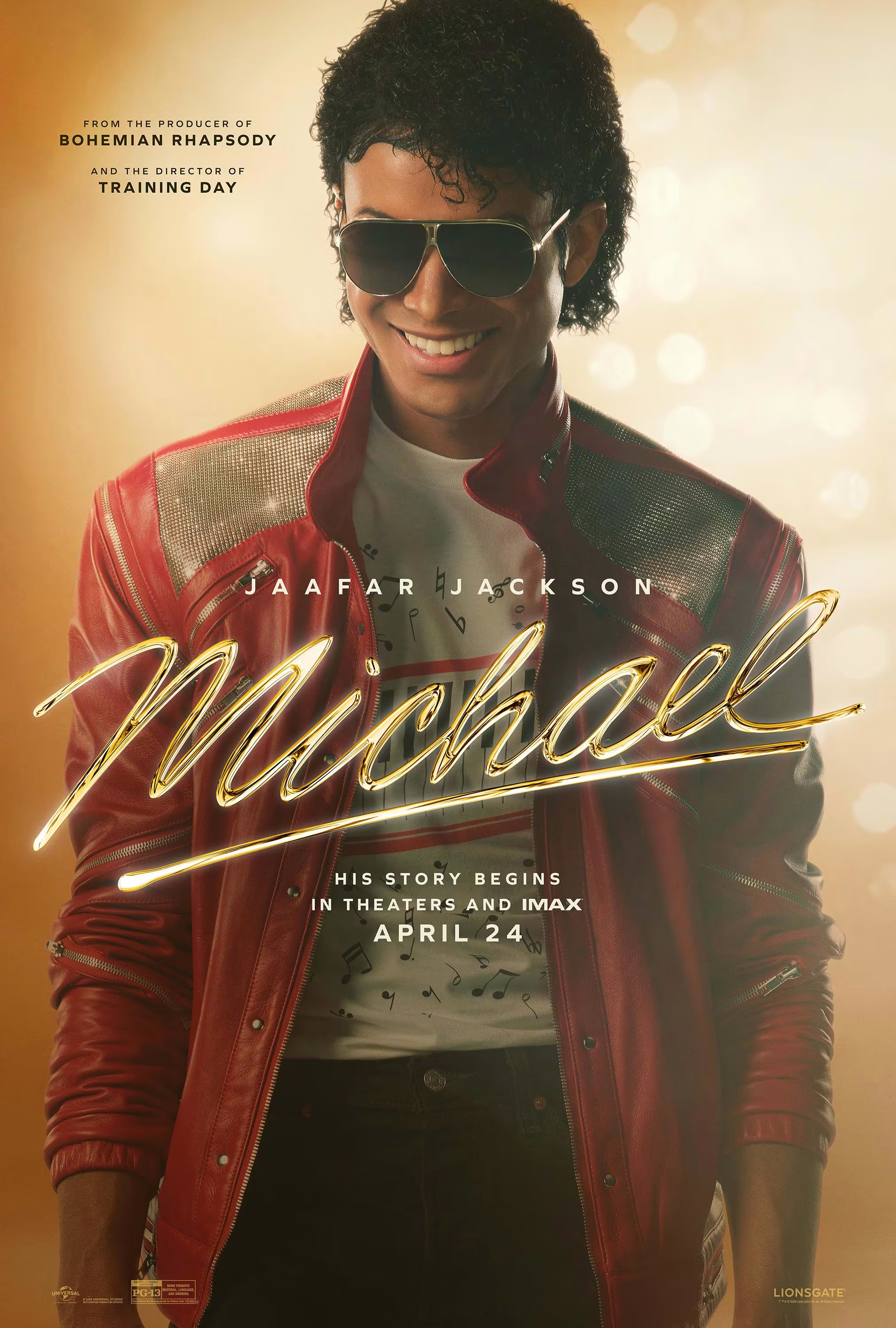
April and May 2026 gave us two blockbusters that could not be more different in tone. First, the gritty, emotionally charged biopic Michael directed by Antoine Fuqua and starring Jaafar Jackson as his uncle (yes, the “King of Pop” Michael Jackson).
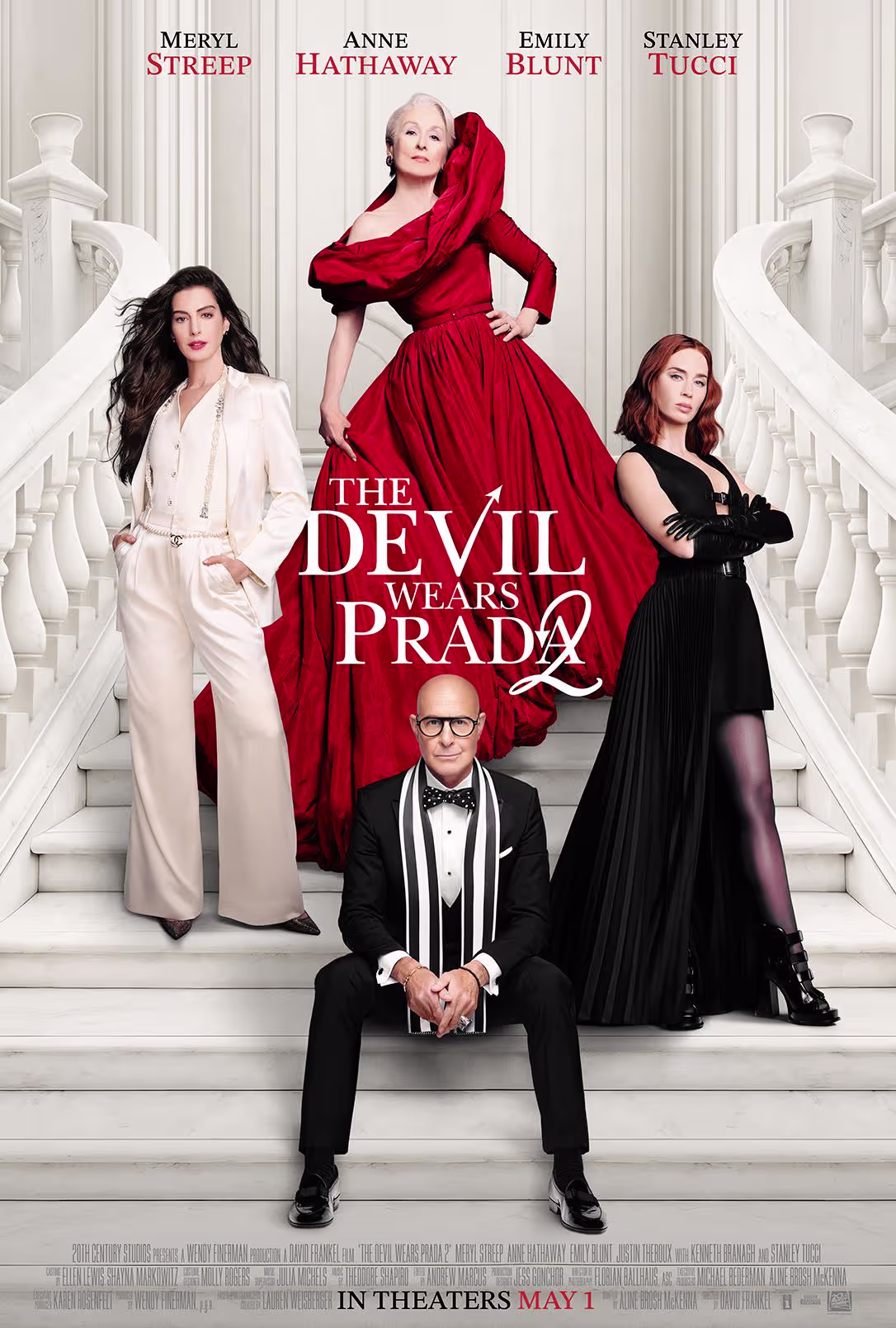
The other one is the gloriously camp sequel The Devil Wears Prada 2 directed by David Frankel, reuniting Meryl Streep, Anne Hathaway, Emily Blunt, and Stanley Tucci twenty years on.
The numbers speak for themselves when it comes to audience appetite. The Michael teaser trailer was viewed 116.2 million times in its first 24 hours, setting a record for any musical biopic or concert film trailer in history. Meanwhile, The Devil Wears Prada 2 brought back the core four for the eagerly awaited sequel to the 2006 phenomenon that defined a generation. Two properties with enormous cultural weight, two completely different visual languages, and two websites that reflect that split almost perfectly.
MPiFY’s take is that the Michael movie website does something smart and increasingly rare in entertainment web design: it commits fully to a single aesthetic and does not blink. The site opens to a warm, textured visual world: a grainy, film-grain background layered over a palette of deep maroon and golden brown, with the film’s title rendered in a flowing cursive wordmark. It is a deliberate aesthetic departure from the cold, high-contrast minimalism most biopics default to.
This is a considered example of what designers now call Retro Minimalism: an approach that strips away clutter not toward coldness, but toward warmth and nostalgia. The grainy texture and muted colour palette evoke analogue-era photography and vintage print design, which for a film about the most iconic pop star of the 20th century is exactly the right emotional register.
The IMAX-forward positioning reinforces scale. The Michael movie opened to USD 217.4 million worldwide in its opening weekend, and the site’s immersive, drama-first design played its part in building that

The answer is not budget. It is the intention. Film websites work when every design decision, from typography weight to scroll behaviour, reflects the film’s emotional register.
The site for The Devil Wears Prada 2, built by Powster for 20th Century Studios, takes a different but equally deliberate approach. High-contrast black and white as the structural backbone, punctuated by bold red accents that scream fashionista without ever tipping into chaos. The elegant serif typography does the rest, giving the whole site the authoritative weight of a flagship fashion editorial. It reads exactly like a high-end fashion magazine, which is precisely the point. Runway Magazine energy, fully translated into a web interface.
Where Michael movie web design leans into drama and void, The Devil Wears Prada 2 web design leans into elegance and legibility. Both choices are correct for their contexts. That is the whole lesson.
Here is how the two official film sites stack up across the key dimensions of entertainment web design:
MPiFY works with clients across lifestyle, hospitality, and creative industries, and the lesson from both of these film sites is essentially the same one we give every client who comes to us for a web redesign: your website is not a brochure, it is a brand experience, and the design language needs to make that clear before anyone reads a single word.
What both sites do brilliantly, regardless of their different aesthetics, is commit. There is no hedging. No template compromise. No “let’s just pick something neutral.” Michael goes with retro minimalism aesthetics because the film demands certain nostalgic vibes that appeal to the younger crowd as well. The Devil Wears Prada 2 goes editorial monochrome with a touch of bold red because the film demands glamour. Every font weight, colour choice, and navigational decision is in service of the emotional world the film wants you to inhabit. That clarity of intent is something every lifestyle and entertainment brand can and should apply, regardless of whether they have a Hollywood studio budget behind them.
If these two sites are a snapshot of where entertainment web design is in 2026, the broader trends tell the rest of the story. The web design world is currently split between two camps, and both are thriving for different audiences. On one side, Retro Minimalism, a warm, texture-led aesthetic with analogue roots that the Michael movie website embodies through its grainy backgrounds, earthy palette, and cursive wordmark. On the other, TDWP 2 website shows what designers are calling Editorial Maximalism: fashion-forward clarity, bold, loud, personality-first design that stops the scroll instantly and refuses to apologise for it.

The research supports why both work. Now, let me tell you a not-so secret: The web design tools that were previously available only to studios with serious budgets are now accessible to any brand willing to invest in a decent design partner.
Immersive 3D web experiences, scroll-triggered animations, and interactive layouts are no longer the exclusive domain of experimental studios and high-budget brands, but are becoming standard expectations in lifestyle and entertainment categories. If your website still feels like it belongs in 2022, your audience has already noticed.
Our team at MPiFY is obsessed with this stuff, not just because it is interesting (though it absolutely is), but because it directly affects how well the websites we build for clients actually perform. Whether you are running a boutique hotel, a luxury lifestyle brand, a creative studio, or a product company with a story worth telling, your website has the same half-a-second window that Michael and The Devil Wears Prada 2 had to make an impression. The only question is whether yours is built to make the most of it.
Our web design services cover everything from initial brand strategy through to fully custom development and launch. We have built websites for clients across the globe from Malta to the UK and UAE, across hospitality, iGaming, professional services, and the creative industries. If you want a site that feels like it was designed with intention rather than assembled from a template, that is exactly what we do.
Ready to give your brand the website it deserves? Get in touch with MPiFY today and let us build something worth landing on.
Entertainment web design is the practice of building websites where the brand experience itself becomes the content, typically used for films, music artists, events, and lifestyle brands.
The Michael movie website uses a retro minimalist aesthetic: a grainy textured background, a colour palette built around deep maroon and golden brown, and a cursive title wordmark that evokes vintage print and analogue photography rather than modern digital minimalism.
The site uses a clean, editorial aesthetic built by Powster for 20th Century Studios, with structured navigation and a polished fashion-magazine tone.
The dominant trends in this case are Retro Minimalism (nostalgic elements meet minimalism) and Editorial Maximalism (bold, loud, personality-driven design), alongside immersive 3D and scroll-triggered animation.
Users form a visual opinion of a website in just 50 milliseconds, making design the single most critical first touchpoint for any entertainment or lifestyle brand.
Yes; MPiFY builds custom websites for lifestyle, hospitality, and creative brands that apply the same intentional design principles used by leading entertainment properties.
Movie websites set visual benchmarks for emotional resonance and brand commitment in entertainment web design, and those principles translate directly to hospitality, fashion, and lifestyle brand sites.


.svg)
