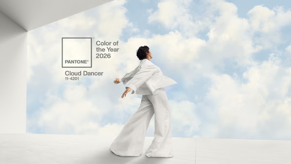
Every year, the Pantone Colour of the Year sparks conversation across the creative industry. Sometimes it’s bold, sometimes playful, sometimes divisive, like last year's colour, the Mocha Mousse. For Pantone Colour of the Year 2026, they made a quieter choice when announced the PANTONE 11-4201 Cloud Dancer, a soft, ethereal white designed to bring a sense of calm, clarity and breathing space into an increasingly noisy world.
Table of Contents
At first glance, that might not sound revolutionary. But for creative agencies, designers and businesses investing in branding, website design, SEO and AI-driven systems, this choice is far more strategic than it appears.
And that leads us to an important question we’ll come back to at the end of this article:
Keep reading and you'll know the answer!
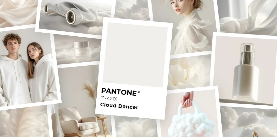
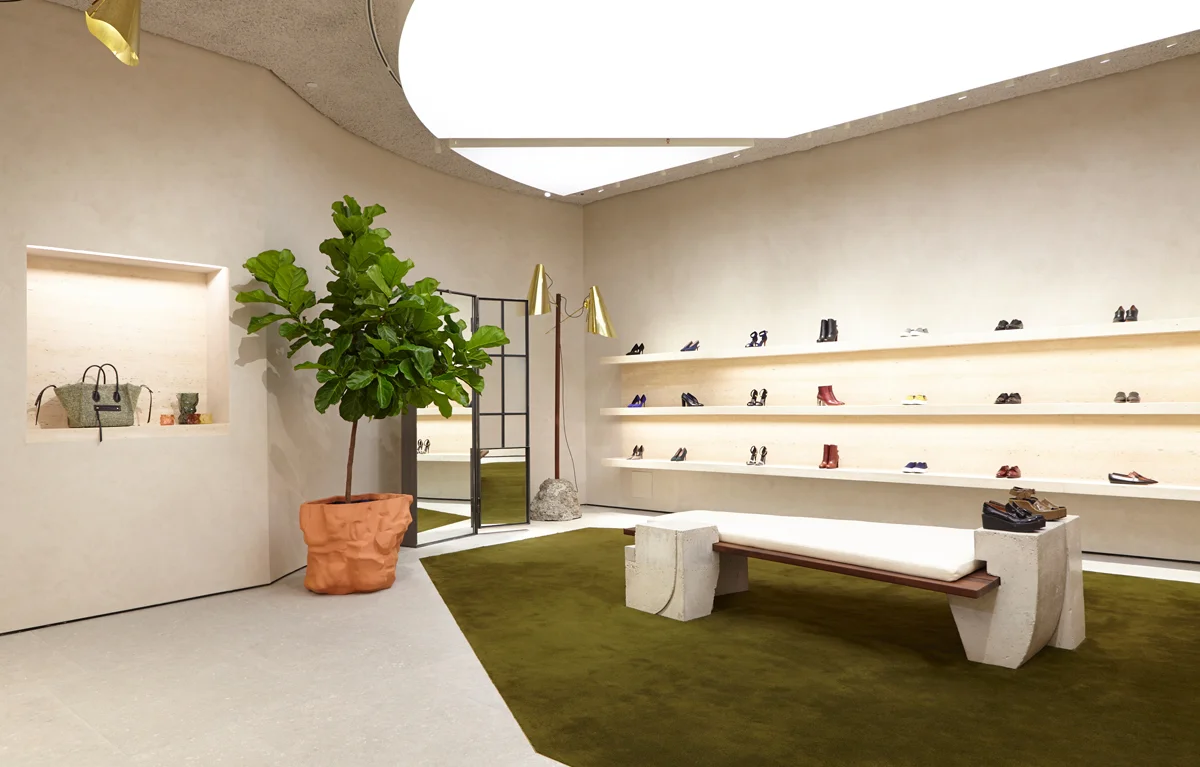
Pantone describes Cloud Dancer as a calming, airy white that invites focus and reflection rather than distraction. Unlike a pure, clinical white, Cloud Dancer has warmth and softness, it feels human rather than sterile.
From our perspective at MPiFY, this choice reflects a broader cultural shift we’re already seeing with clients in Malta and the UK. People are tired of visual overload. They’re tired of brands shouting. They’re tired of interfaces that try too hard.
Instead, there’s a growing appetite for brands that feel confident enough to slow things down. Cloud Dancer isn’t meant to be the hero colour. It’s meant to be the space around the hero, and that distinction matters.
Over the past few years, colour trends have leaned heavily towards energetic, expressive tones. Cloud Dancer marks a clear change in direction. From our perspective at MPiFY, this reflects a wider cultural moment: people are overwhelmed, visually and mentally.
Brands that continue to shout risk being ignored. Brands that communicate with restraint increasingly stand out.
Unlike pure white, Cloud Dancer reduces glare and visual fatigue on screens. This difference is subtle, but in digital experiences, especially content-heavy websites, it has a measurable impact on comfort and readability.
If there’s one thing we’re confident about heading into 2026, it’s this: clarity will outperform complexity.
Website design trends may cycle through styles, glass effects, gradients, maximalist layouts, but underneath all of that, user expectations are becoming surprisingly simple. People want to understand what a website is about quickly, without friction or fatigue.
White space isn’t empty, it’s functional. It creates rhythm, guides attention and makes content easier to digest. Cloud Dancer supports this by acting as a neutral canvas that lets structure do the work instead of decoration.
This is where Cloud Dancer fits naturally into modern web design. If it is used correctly, it creates visual breathing room. Typography becomes easier to read. Sections feel more deliberate. Calls-to-action stand out without shouting. Navigation feels intuitive rather than overwhelming.
From a UX perspective, neutral backgrounds like Cloud Dancer help reduce cognitive load. From a business perspective, that often translates into users staying longer, scrolling further and interacting more confidently, all signals that matter for conversion and SEO alike.
We’re already seeing this approach resonate strongly with service-based businesses, especially in competitive UK markets and trust-driven Maltese industries.
On smaller screens, overstimulation happens faster. Softer neutrals reduce cognitive load and improve tap accuracy, which is critical for mobile UX and conversion rates.

Branding trends don’t exist in isolation, they reflect how people want to be spoken to.
In Malta, brands often need to establish credibility quickly. In the UK, brands are scrutinised and compared relentlessly. In both cases, overly aggressive or trendy visual identities can backfire. Cloud Dancer supports a different kind of branding language: one that feels composed, considered and quietly confident.
Rather than replacing a brand’s core colours, Cloud Dancer works best as a supporting neutral. It gives structure to brand systems, allowing stronger colours, typography and imagery to perform better without competing for attention.
From an agency perspective, we see the most successful brands using trends like this selectively, not as a rebrand trigger, but as a refinement tool.
Good branding doesn’t chase attention. It earns trust.
When everything competes for attention, restraint becomes a signal of confidence. Cloud Dancer helps brands establish a calm visual baseline that supports messaging instead of competing with it.
Rather than replacing existing brand colours, Cloud Dancer works best as a supporting neutral, used in layouts, backgrounds and supporting assets to strengthen consistency across touchpoints.
Not every brand benefits from extreme minimalism. For highly expressive or youth-focused brands, Cloud Dancer should be balanced with strong accent colours to avoid visual flatness.
Colour choices don’t directly affect search engine algorithms, but they do affect how users interact with a page, and that matters more than ever.
Pages that feel calm and easy to read tend to keep users engaged longer. Neutral surfaces like Cloud Dancer improve legibility and reduce visual friction, especially for long-form content.
Clear hierarchy makes it easier for users to find answers quickly. When headings, sections and CTAs are visually distinct, users navigate more confidently, a positive signal for search engines.
As AI becomes embedded in design and marketing workflows, colour consistency becomes a technical requirement rather than a stylistic choice.
AI-generated layouts, visuals and templates perform best within predictable systems. Cloud Dancer provides a stable base that allows AI-generated elements to remain cohesive across channels.
From social posts to landing pages, a neutral foundation reduces the risk of visual clashes when content is generated or adapted automatically.
The answer is simpler than it sounds.
Cloud Dancer improves performance by improving comprehension. When users can understand a page quickly, trust builds faster. When interfaces feel calm, people stay longer. When content is easy to consume, engagement increases.
Cloud Dancer doesn’t compete for attention, it creates the conditions for attention to land where it matters most. That’s why, despite its subtlety, it’s a powerful tool for brands refining their digital presence in 2026.
Our perspective at MPiFY, we see the Pantone Colour of the Year as a cultural signal, not a design instruction manual. For 2026, that signal is clear: clarity, restraint and confidence will outperform noise.
Cloud Dancer isn’t a colour to copy blindly, it’s a reminder that sometimes, the most effective creative decisions are the quiet ones.
Pantone Colour 2026 is PANTONE 11-4201 Cloud Dancer, a soft, airy white chosen to reflect calm, clarity and balance in modern design systems.
The near-white Cloud Dancer colour works particularly well for service-based, professional and content-driven brands. Highly expressive brands may use it as a supporting neutral rather than a dominant colour.
It does not directly affect search rankings. However, by improving readability, structure and user experience, it may positively influence behavioural signals that impact SEO performance.
In most cases, Cloud Dancer colour is best used as a refinement tool within an existing brand system rather than as the sole foundation for a full rebrand. Our perspective at MPiFY, we see the Pantone Colour of the Year as a cultural signal, not a design instruction manual. it’s a reminder that sometimes, the most effective creative decisions are the quiet ones.