


Pantone 2027 Prediction: Which Colour Takes the Crown?
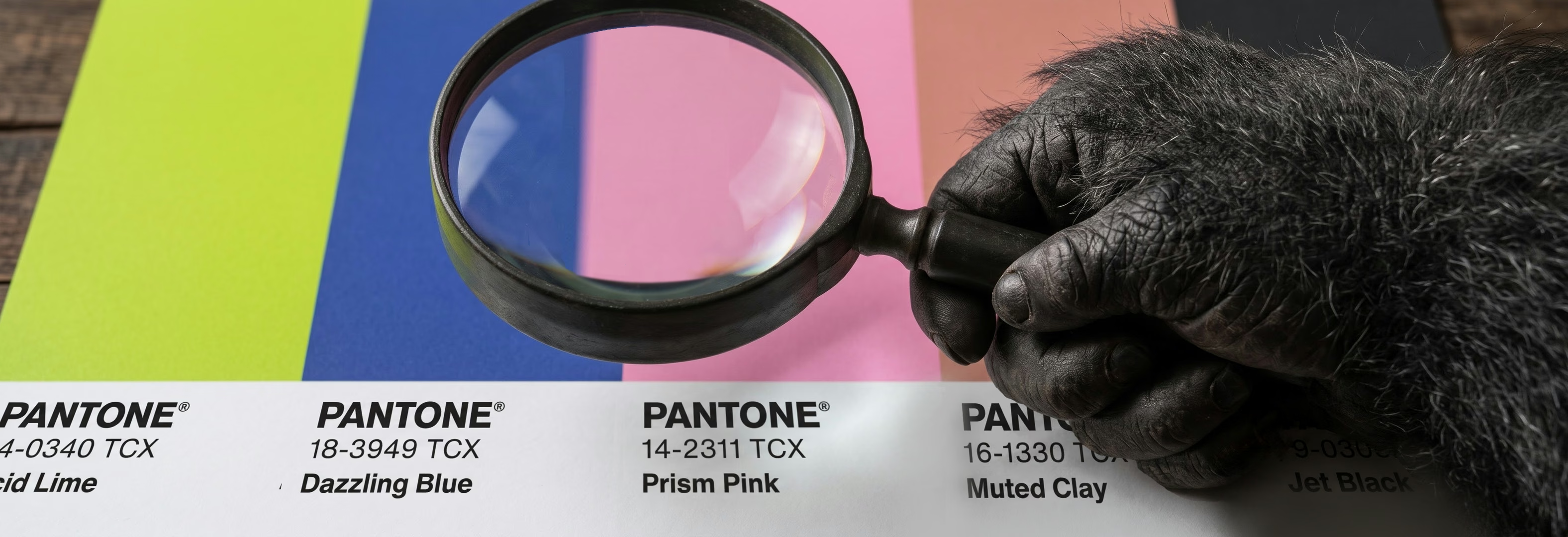
Pantone will crown its Color of the Year 2027 in early December 2026, and the design crowd is already treating the reveal like a cup final. Here is our Pantone 2027 prediction, built on five pop culture aesthetics from 2026, so you can place your bet before the envelope opens.
Table of Contents:
- When Is Pantone 2027 Revealed?
- The Clues Pantone Already Dropped
- Which Aesthetic Wins Pantone 2027?
- Slow living a.k.a soft comfort
- Chaotic storytelling
- Re-enchanting a.k.a whimsical
- Dopamine design
- Monochrome neo-brutalism
- Our Pantone 2027 Betting Slip
- Why Is Everyone Painting Green?
- Should Brands Chase Colour Trends?
- Colour Choices That Outlast Trends
- Let’s Talk About Your Colours
When Is Pantone 2027 Revealed?
Pantone usually reveals its Color of the Year in the first week of December, so the 2027 shade should land within days of this article going live. The programme has been running for nearly three decades, and the 2026 pick, Cloud Dancer, made history as the first white Pantone has ever chosen. After a year of soft, quiet white, the real question is whether Pantone keeps the volume down or cranks it back up.
The Clues Pantone Already Dropped
Pantone never leaks the winner, but it does leave crumbs. In March 2026, Pantone Color Institute executive director Leatrice Eiseman unveiled the Pantone View Home + Interiors 2027 forecast at The Inspired Home Show in Chicago. It holds seven palettes for 2027: Delight, Allure, Lucid, Hush, Honest, Grounded, and Elation.
The forecast’s theme, “Sense-Abilities”, treats colour as a break from a world that feels too loud. Whatever Pantone picks, expect a story about comfort and time away from the screen.
Which Aesthetic Wins Pantone 2027?
Our bet is on one of five aesthetics that pop culture pushed hard through 2026. Each one points to a different colour family, with a matching clue in the Pantone forecast.
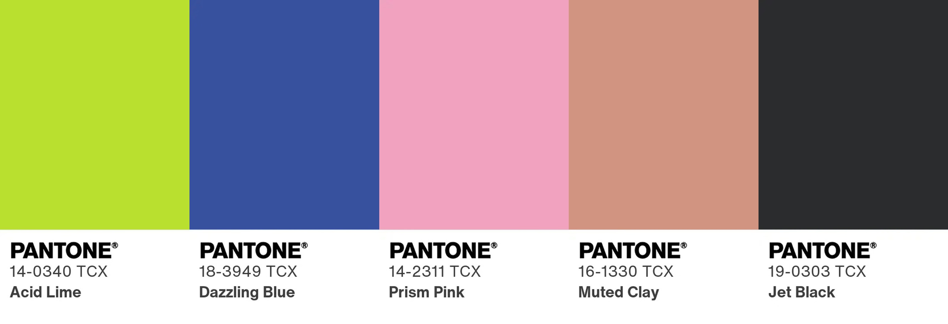
- Slow living a.k.a soft comfort. Burnt-out audiences swapped hustle culture for slow mornings, small gatherings, and homes that feel like a hug. WGSN expects people to embrace a slower pace of life going into 2027. Our guess is Muted Clay or Toasted Almond, sitting between Pantone’s quiet Hush palette and the warm browns of its Honest palette.
- Chaotic storytelling. Think Charli XCX’s Brat-era energy, scrapbook collages, and colours that clash on purpose. Our guess is Acid Lime, a close cousin of Pantone’s eclectic Elation palette.
- Re-enchanting the ordinary a.k.a whimsical. Surreal runway themes and toy-box collabs turned everyday objects into tiny fairy tales. Etsy searches for whimsical jewellery and decor each rose by at least 50% year on year. Our guess is Prism Pink, matching the soft summer joy of Pantone’s Delight palette.
- Dopamine design. Neon gradients and saturated colour blocking exist for one job: stopping your thumb mid-scroll. Our guess is Dazzling Blue, and WGSN and Coloro have already named Luminous Blue as their own Colour of the Year 2027.
- Monochrome neo-brutalism. Rave flyers, indie magazine grids, and raw concrete gave us stark black and white with huge type. Our guess is Jet Black, a proper plot twist after Pantone’s first ever white.
Our Pantone 2027 Betting Slip
We turned the five aesthetics into odds, plus one wildcard from the paint aisle. Purely for fun, so please don’t remortgage anything.
Why Is Everyone Painting Green?
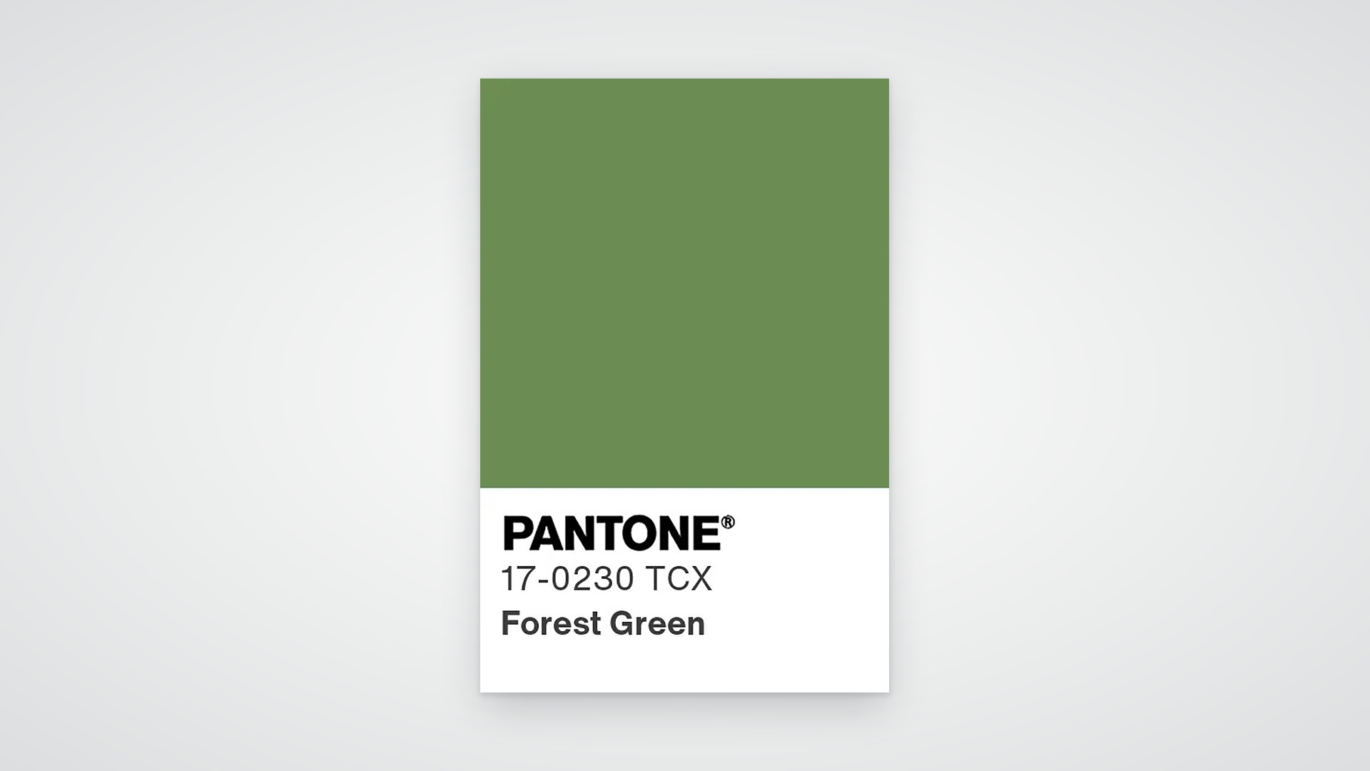
Green is the shade the big paint brands keep backing for 2027. Sherwin-Williams named Celery on 15 September 2026, and Benjamin Moore followed on 14 October 2026 with Webster Green HC-130. Behr went olive and Dulux picked Soulful Sage, so the green vote is close to unanimous. With Grounded and Lucid in the Pantone forecast, a mid-tone like Forest Green sits right behind blue on our slip.
Should Brands Chase Colour Trends?
No, brands should borrow from colour trends without rebuilding their identity around them. Malta-based creative agency MPiFY sees this question pop up every December, usually right after a client spots the new Pantone shade on their feed.
A fashionable colour won’t save a forgettable brand. iStock found that six in ten people distrust the ads they see, mostly because they look AI-made or fake. Feeds are filling with look-alike visuals, and 64% of consumers say they prefer real images in ads. People reward brands with a clear point of view, and that starts with a consistent visual identity design, not a seasonal hex code.
This is where brand strategy services earn their keep. They tell you which colours belong to you and which ones you can flirt with for a campaign. Our graphic design team then turns that thinking into assets that still feel like you in a Pantone year.
“Pantone picks a colour for the whole world. Your brand needs a colour for your customers. They are rarely the same shade, and that is fine. Use the trend as a guest, not a new flatmate.”
Justin Ciappara, Co-Founder & Creative Director of MPiFY.
Colour Choices That Outlast Trends
The smartest way to use a Color of the Year is as an accent you can switch off in January. A limited-edition pack or a seasonal social series can wear the new shade without touching your logo or core palette.
Before you commit, test the new colour against your palette for contrast, especially on buttons and small text. If it fails, it belongs in a mood board, not your homepage. We covered this balance in our guide to startup brand identity in the AI era.
Let’s Talk About Your Colours
Pantone gets one guess a year. You can get a second opinion today. If your brand palette feels dated or a bit too AI-smooth, MPiFY can help you sort out what to keep and what to refresh. Contact MPiFY and let’s look at your colours together.
FAQ
What is the Pantone Color of the Year 2027?
Pantone had not announced its Color of the Year 2027 at the time of writing, and the reveal is expected in early December 2026.
When does Pantone announce the Color of the Year?
Pantone usually announces its Color of the Year during the first week of December.
What was Pantone’s Color of the Year 2026?
Pantone’s Color of the Year 2026 was PANTONE 11-4201 Cloud Dancer, a soft white.
What is the Pantone View Home + Interiors 2027 forecast?
It is Pantone’s 2027 home colour forecast, built around seven palettes under the theme “Sense-Abilities”.
Who chooses the Pantone Color of the Year?
The Pantone Color Institute chooses it by studying culture, fashion, film, and design.
Should my brand switch to the Pantone colour?
Your brand should keep its core palette and use the Pantone colour as a seasonal accent if it fits.
Key Takeaways
- MPiFY predicts one of these colours for the PANTONE 2027 Colour of the Year: Muted Clay (or Toasted Almond as an alternative), Acid Lime, Prism Pink, Dazzling Blue, Jet Black or Forest Green.
- Pantone usually reveals its Color of the Year in the first week of December.
- Cloud Dancer, the 2026 pick, was the first white Pantone has ever chosen.
- The Pantone View Home + Interiors 2027 forecast holds seven palettes.
- Etsy searches for whimsical jewellery and decor each rose by at least 50% year on year.
- WGSN and Coloro named Luminous Blue their Colour of the Year 2027.
- Sherwin-Williams named Celery its 2027 colour on 15 September 2026.
- Benjamin Moore named Webster Green HC-130 its 2027 colour on 14 October 2026.
- Six in ten people distrust the ads they see.
- 64% of consumers prefer real images in advertising.
Read MPiFY first on Google

Keep reading



CONNECT WITH MPiFY
CHAT WITH US TODAY


